
| How to Play | Discussion Group | Blog | Release Notes |
Well of Souls: Rune Runner is a tiny 3D Role Playing Game.
You create a character, battle your way across multiple maps, performing quests and advancing a story line.
This is a game in development, and I have published it early so as to solicit feedback and performance data from a variety of phones
My goal was to port (portions of) my game "Well of Souls" from the PC to Android, and make it 3D in the process. You might think of it as "Well of Souls Lite, in 3D".
Now Open For Public Alpha Test
As promised, I am lowering the price to $1.99 to announce the beginning of the Alpha Test period. I know it's sort of lame to charge money during the test phase, but luckily the Android Market will give you a full refund if you decide that you have no faith the game will ever be enjoyable for you.
But if you DO enjoy the game, then you will have obtained it at a bargain price, since the final release price will no doubt be higher. Probably not a LOT higher, but hey, you might have saved a dollar!
If you buy (and keep) the game at today's price, you will NOT have to pay the 'release' price once it gets formally released -- you will already own the game.
Presently this is more of an Engine Test than a Game Test, as there are only a handful of monsters and quests. But more will appear in future updates.
If you have comments/suggestions/problems during the test, please email me. (the email link is on the Android Market page, but you can use [email protected] if that's more convenient)
At this point, I am particularly interested in feedback about how it plays on different phones.
- The game requires Android 1.6 or later, and probably is most fun on Android 2.1 or later.
- The frame rate you get will be both a function of your phone's CPU speed, and the fanciness of the 3D support in the phone. It plays well on the Droid and Droid Incredible, but is marginal on the Droid Eris (5-10 fps). I would particularly love to hear what frame rate YOU get on YOUR phone :-)
- You can turn on the frame rate meter by tapping the phone's menu button, selecting OPTIONS, then DEBUG OPTIONS then tap the frame rate selection to turn it ON.
It's a little premature to provide a user's manual at this stage of development, but if you take the following with a grain of salt, and hold out hope for art improvements, you should be able to work your way through it.
Generally speaking, you will encounter a story line which will motivate your actions, but I can't describe that yet, so this is intended to document the mechanics of navigating the menus, walking the 3D world, and battling monsters.
After you start the game and sit through the loading screen (now, with Elvish!), you will find yourself on the Character Creation screen.
Character Creation
The first time you play the game, you will start on the character creation screen. It looks a bit like this:
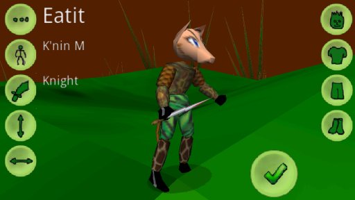
This screen offers you the choice of some customizations of your character (name, race, weapon, height, weight, face, clothing).
Tap the buttons until you see something you can tolerate (each tap randomly selects one of the available choices). Then press the green check button to accept this character and get it created.
Character Selection
If you have played before, the game will start on the Character selection screen.
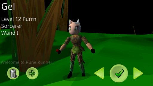
This screen lets you rummage through your existing characters (tapping the left and right arrow buttons), then start/resume that character's adventure.
- Press the green check button to select this character and resume its adventure.
- Press the android BACK button on this screen to exit the game.
Generally speaking, pressing the BACK button will close dialogs or exit the current game mode, eventually returning you to the Character Selection screen. One more BACK from there quits the game. Back..Back..Back...... exit.
- Press the green plus sign to create ANOTHER character (you can have up to N characters.) (final value of N to be determined)
- Press the garbage can button to delete the current character (after confirmation)
Your character is automatically saved when you exit the game. However, UNINSTALLING THE GAME WILL PERMANENTLY DELETE ALL YOUR EXISTING CHARACTERS.
You can, of course, re-install and start new characters, but I just wanted to be clear that your characters are NOT stored on some magic server in the sky. They are stored ON YOUR PHONE. (Android 2.2 phones can move the game back and forth to SD Card.)
Walking the World
Once in world, your character will appear roughly where you left it. Your goal is then to perform the storyline quests given to you. This will probably require a lot of walking around and killing stuff.
It's an RPG, you know the drill. Did I mention there's gold?
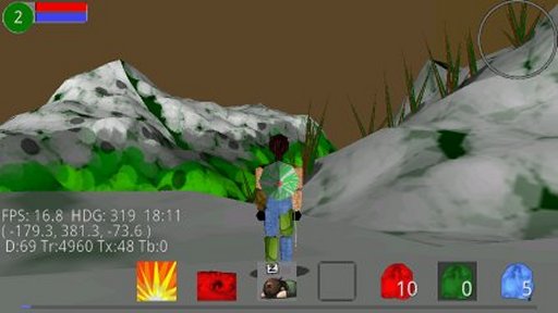
To move your character around, just drag your finger anywhere in the general middle of the screen.
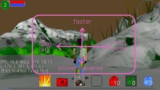
- Dragging left and right will turn your character.
- Drag 'up' to speed up and drag 'down' to slow down or stop. Your character will keep moving at its current speed until you stop it.
- You can also drag down (from stopped) to get a little reverse action going.
You may have played games that use a virtual joystick to move around. I found that forcing you to hold your finger down to move was surprisingly tiring and painful, even after a short period. Maybe that's just me.
Changing the Camera Angle
There are a lot of beautiful vistas to enjoy (one hopes) so you will want to be able to move your camera angle around without actually moving your character.
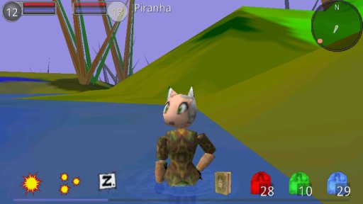
To control the camera, drag your finger along the edges of the screen. (roughly in the areas shown below).
Your finger drag is either steering your character (middle of the screen), or adjusting your camera (edges of the screen). It might take you a moment to get a feel for just how close to the edge you have to be.
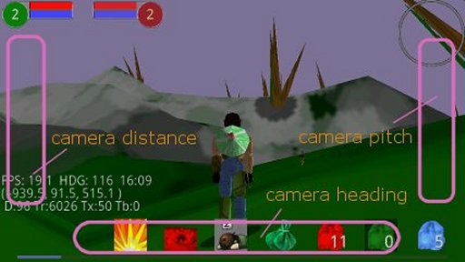
- Dragging left and right along the bottom edge of the screen adjusts the camera's heading.
- Dragging up and down along the right edge of the screen controls the 'pitch' (up/down).
- Dragging up and down along the left edge of the screen allows you to zoom in and out.
Don't be afraid to drag right on top of the buttons on the bottom. They should ignore your dragging, and just react to being 'tapped.'
Selecting a Target
As you walk around, you will encounter bad things.
Here we see someone in the distance ahead of us. Because we had no target before he showed up, the game has automatically targetted him for us.
While targeted, he has a red shadow, a red arrow over his head, and a life meter at the top of the screen, right next to our own.
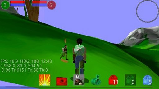
We can't attack anything unless we target it first.
To select a target, just tap on the 3D character itself. Alternatively, tap on the target life meter to cycle between available targets.
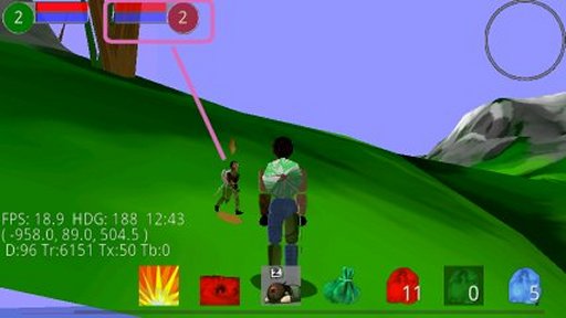
The life meters show the hit points (red) and mana points (blue) of yourself and your current target. Your goal is to make his red meter go empty before yours does.
The life meters also shows a character's "level."
Battle starts when you attack him, or he attacks you, and continues until one of you is dead (or runs away successfully).
This is NOT a turn-based game. You are free to attack whenever you have a charged-up action available. But actions all have a recovery time before you can use them again.
There is no PAUSE button per se, but some actions (like opening the MAP screen) have a partial pause effect. Don't count on this, however, the end goal is to have no pausing whatsoever.
Action Buttons
Along the bottom of the screen are your action buttons.
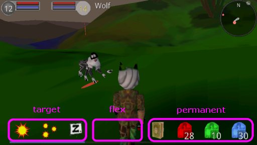
Along the far right are the 'permanent' actions which are always available.
- Quest Diary (shows the quests you are working on)
- Use Red Rune (health recharge)
- Use Green Rune (stamina boost)
- Use Blue Rune (mana recharge)
Along the far left are the buttons which vary depending on what you have targeted:
- An enemy (attack buttons, unless it's dead)
- A friend (no attack buttons, but you get a 'chat' button)
- A Dead enemy (nothing, at present)
- No Target (nothing, at present)
In the middle are the 'flex' buttons that come and go as needed:
- Dismount button (when mounted)
- Fishing button (when wading in water)
- Farming button (when on good soil for planting)
Fighting
During a battle, your character will automatically engage in melee attacks against any nearby monster that attacks. (I mean, you don't have to push any buttons, he will just make standard attacks with his weapon, as fast as it recharges).
However, your melee attacks are not your strongest.
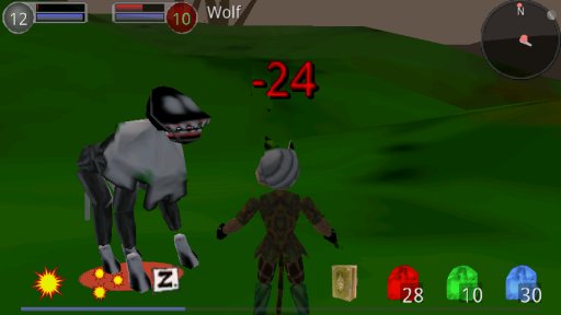
With an enemy targeted, you have three attack buttons in the left set of action buttons.
The idea is:
- The left button is your biggest, most special, attack. But it uses the most mana, and has the longest recharge period.
- The middle button is your 'attack everyone' attack, which is weaker, but affects all nearby enemies.
- The right button is your 'stun' attack. It delivers the least damage, but has a chance to stun the enemy (both preventing him from hitting you, and possibly letting you run away)
The permanent action buttons give you quick access to your primary runestones (Ruby, Emerald, and Sapphire).
Runes have multiple uses. But for now, just accept that you can use them like health potions.
- A ruby rune will recharge hit points (1/3 your total)
- A sapphire rune will recharge mana (1/3 your total)
- An emerald rune will give you a stamina buff.
Death
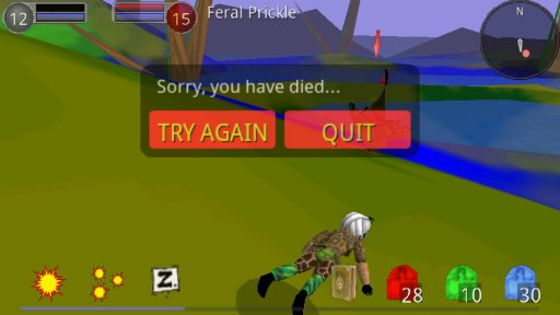
You will occasionally die, your corpse lying embarassingly at the feet/tentacles of your opponent.
You will see a dialog appear offering you the choice of popping back to life right where you are, or giving up and returning to the Select Character screen.
Levelling
Along the VERY bottom of the screen is a thin blue line (heh) which is your 'experience meter.'
When you kill a bad thing, or complete a quest, you earn some experience. When that meter fills up completely, you earn a 'level' and that increases all your stats a little. (more hit points, more mana, stronger attacks, better defense, etc)
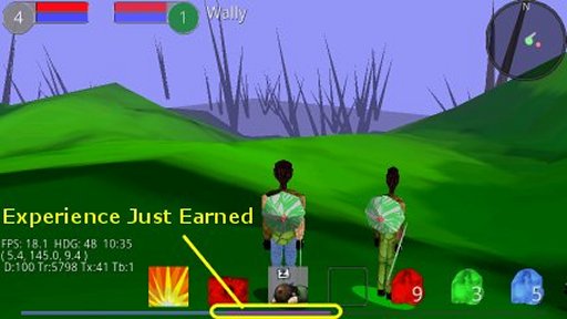
After earning experience, the experience bar lengthens and the newly exposed area 'glows' for a moment to help you revel in your achievement.
You also get a free recharge of HP and MP when you level up. Which is good because you don't want to use up all your rune stones as you need them for something other than just healing potions.
Level ups also earn you Onyx Runes, which you can use to boost your abilities, via the STATs screen.
Stats
To open the STATs screen, tap your own life meter (in the upper left of the main screen).
This opens a panel that looks like this:
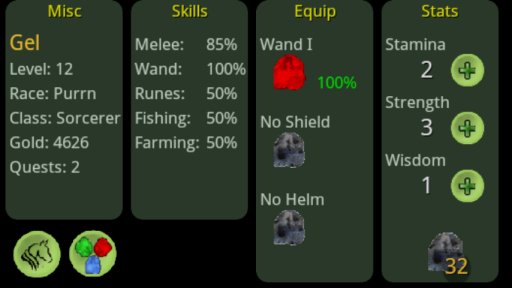
These are divided into four categories and are mostly self-evident, but the interesting bits are:
- skills start at 50% (which means you have a 50% chance of success when exercising the skill) and go up a little each time you fail.
- The Rune skill controls your success in rune weaving.
- Each of your three pieces of major equipment (Weapon, Shield, and Helmet) can be at one of four levels (I, II, III, or IV).
- Each piece of equipment may have a (single) rune attached to it. Tapping on the appropriate rune icon will open a dialog letting you pick which rune to attach.
- Equipment runes take damage as you battle, and will eventually break (and disappear). You may replace an equipment rune at any time, using this screen.
- While an equipment rune is in effect, its color determines which elemental effects it benefits
- The percentage shown to the right of each rune is its remaining health. This starts at 100% and drops down to zero as the rune is damaged. You cannot repair a rune, you can only replace it with a new rune.
- Each time you level up, you earn a few Onyx runes (black runes) and your current count of Onyx runes is shown in the lower right corner of the page
- You can spend Onyx Runes to buy new ability points, boosting your Stamina, Strength, or Wisdom. Just tap the button next to the stat you want to boost.
In the lower left are the 'second tier actions'
- Mounts (opens a dialog to let you choose a mount to ride)
- Rune Weaving (opens the rune weaving panel)
Rune Weaving
One of the action buttons on the stats screen opens the Rune Weaving screen. This screen lets you create new runes by either weaving together or cracking apart other runes in your possession.
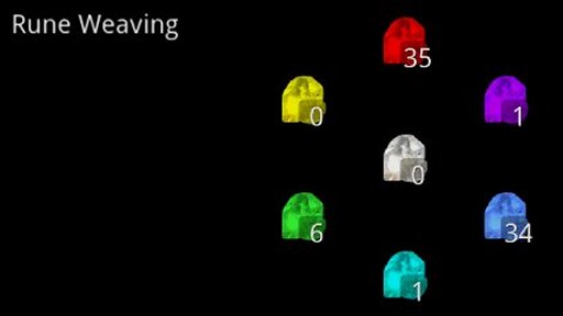
This is basically a color-mixing mini-game.
Over the course of your adventure, you will naturally collect some number of red, green, and blue 'primary' runes.
To make a new rune, just tap on the color you want. If you want a yellow, purple, or aqua rune (the 'secondary' runes), then you must weave two runes together.
For example, weaving a Yellow rune requires one red rune and one green rune. You start the weaving by tapping the Yellow rune.
If your weaving is successful, then you will have one more yellow rune, but one less red and one less green rune.
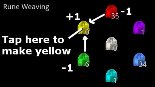
To make a Diamond (white) rune, requires weaving NOT the easy-to-get red/green/blue primary runes, but the harder-to-get yellow/purple/aqua secondary runes.
In the rare circumstance where you are desperate for a primary rune, just tap on what you need and it will 'crack' one of the adjacent secondary runes (whichever you have more of) to recover a primary rune.
Your success in rune-weaving is based on your rune 'skill' which starts at 50% (roughly 50% successful in weaving). A failed weave, or crack, consumes the source rune(s) but provides no product rune.
Fishing
After you do the proper quest, you will find yourself the owner of an invisible Fishing Net.
Fishing is easy, just stand knee deep in any pool of water and a fishing icon action button will appear. Press that button and you will cast your net.
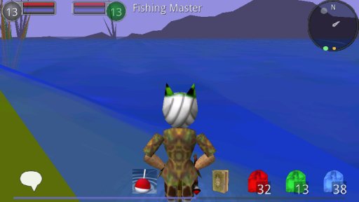
You must be IN the water, but not past your neck deep. Admire the lovely ripples.
Depending on your Fishing skill you will catch one thing or another. When you catch a fish, you automatically check if it has swallowed any sapphire runes, which you remove (without hurting the fish) and the fish is then released back to the water.
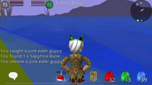
This is a fairly high yield source of sapphire runes. And non-violent.
Farming
Likewise, a different quest will get you a magic seed bag. Again, you must travel to an area with suitable conditions for planting, at which point the seed bag icon will appear (in the same flex action button spot used by Fishing).
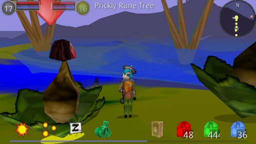
Press that button and you will attempt to plant a seed. Your Farming skill will determine your success rate.
Your magic seed bag comes with a fixed number of seeds. You may have no more than that many seeds planted at any given time.
But when you harvest a plant, you get the original seed back (it's magic!) which you can then replant (in the same place or elsewhere).
It is your responsibility to remember where you planted your seeds, and on which map. However, the map will show a tree icon for each seed you have planted, so it shouldn't be too hard to find them.
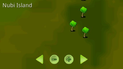
Also, your radar will show a yellow dot for each nearby plant.
To harvest a plant, you must target it, and then attack it. It will fight back, and if you win the battle you will get some number of green runes as your loot.
How many runes you receive is a function of how long you allowed the plant to grow. Full growth provides a large number of runes and takes about 24 hours (real time).
But where is a good place to plant? Hint: plants like water, but prefer 'dirt' to sand.
Mounts
As a result of questing, you will occasionally receive objects which can summon mounts. A mount is just something you can ride (like a horse) and that lets you travel faster, or somewhere you normally could not.
Once you own a mount, you can summon it via the STATS Panel. (Tap on your own health meter to open the STATS panel, then tap the MOUNTS button in the lower left. This will open a list of the mounts you know how to summon.)
Select one then tap 'SUMMON MOUNT' and you will be returned to the game, riding something.
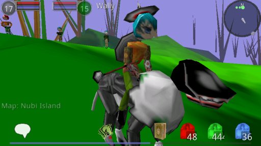
To get off of the mount, tap the dismount button on the main screen (it appears when you are mounted, and supersedes the farming/fishing flex buttons.)
Mounts come in three flavors:
- Land Mounts. These increase your speed while travelling on land, but drop to 1/3 speed when crossing deep water (and walk along the bottom of the water). You are never auto-dismounted from a land mount.
- Sea Mounts. These increase your speed while travelling on water. When moving forward these will float up to the top of the water. Go into 'reverse' mode to sink towards the bottom. If you halt, you will maintain your current depth. You are automatically dismounted if you ride your sea mount up onto land.
- Air Mounts. These increase your speed when crossing any terrain (though some locations may be restricted against flyover.) When moving forward you will rise up to a certain height above the terrain (and crossing a hill will then push you up further). Go into 'reverse' mode to begin to lower your altitude (or just dismount to fall directly to the ground). You are automatically dismounted if you try to enter the sea on an air mount.
Being on a mount does NOT interfere with your ability to fight, unless to do so would be unfair (for example, you cannot fight from an air mount while more than a meter or so above the terrain, since otherwise your enemy might not be able to hit you back. Which would be unfair.)
Map
Tapping the compass/radar circle on the main screen opens the MAP screen (tap the phone's BACK button to return to the game)
The map screen opens to show your current location, but the left and right arrow keys can flip to other maps (but only maps you have visited, or have permission to visit)
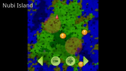
The blinking red arrow represents your current position and heading. You can use your finger to drag the map around, and the plus and minus buttons to zoom in and out on any location you like.
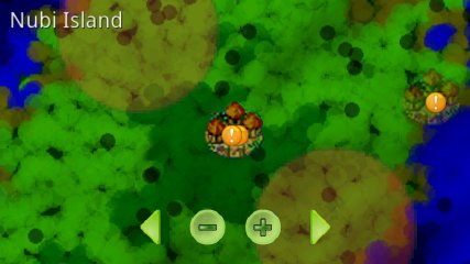
Important locations are indicated with a little village icon of some form (it will be very faded if you have not visited it yet). Larger faded circles indicate 'regions' (usually where a particular sort of monster lives)
Tapping inside a location brings up information about it in the top left of the screen. (and a yellow arrow on the map shows which location it is talking about)
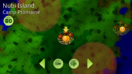
If you have previously visited the location, and it is a teleport destination, then a GO button will also appear. Tapping that will initiate a teleport (or flight) to that location.
Teleport destinations are usually 'safe' locations with no monsters nearby. Often you will find NPCs offering quests in such locations.
That yellow arrow is also your current NAV POINT and when you return to the main game, the radar compass will show a gray dot on the edge of the compass, indicating the location of the NAV POINT. Walk into the light...
Questing
Generally speaking a quest starts when you accept the offer from some NPC (Non-Player-Character). It then requires you to go somewhere and collect something, then to go to its turn-in NPC to get credit.
To tell the story in pictures:
You're wandering the map, when you encounter a golden dot on your radar/compass (that circle in the top right of the screen). You approach and see you have met up with the "Fishing Master."
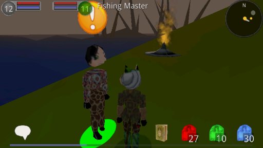
He has an exclamation mark over his head to let you know he has a quest for you. To learn more about it, you need to talk to him. You do that by making the Fishing Master your target (gets that special green shadow, coz he's friendly) and then pressing the CHAT button which appeared in the 'target actions' along the bottom left.
This opens the Quest Dialog:
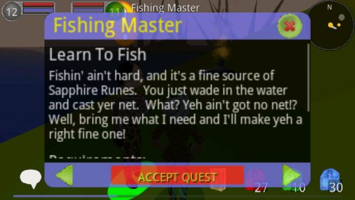
If he has more than one quest to offer you, the green arrow buttons along the bottom would let you switch between them.
If the quest description is long, we use our finger to drag the description up so we can read the rest:
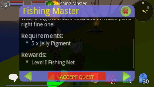
We see that he wants us to collect 5 "Jelly Pigments".
That fishing net looks desirable to us, plus we're a Hero, so we LIKE to help people. So we press the ACCEPT QUEST button. (We can't collect any Jelly Pigments until we have accepted the quest.)
Now the exclamation mark over his head disappears and is replaced by a silver question mark. This means he is the turn-in point for at least one quest, but that we haven't yet met the requirements of that quest (at which point the question mark will turn gold).
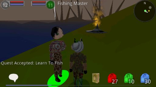
So, let's go collect some Jelly Pigments!
Looking for red dots on the compass is an easy way to find bad guys, and luckily for us there are lots of Jellys a short walk from the Fishing Master.
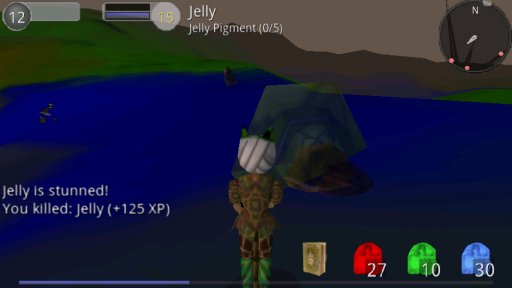
The enemy name tag includes a little extra info to let us see our progress in meeting the quest requirements. (Here we see we have so far collected 0 of the required 5 pigments.)
Tapping an enemy nametag lets you 'talk' to the enemy. If that enemy is part of a quest, this opens a special version of the Quest Dialog with a list of all quests relating to that enemy.
When you kill a quest-related enemy, you will get credit for the kill and might get a drop of a quest-related item (a 'trophy'). You might also get non-quest-related 'drops' (like runes).
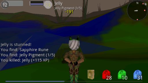
And when you meet the final requirement of a quest, you will also get some notification to remind you.
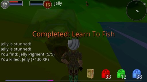
OK, now what? Where's our fishing net? They said there would be cake! Then we remember that we have to return to the turn-in point, which in this case is back to the Fishing master.
If we don't remember where he was, we need to use the map.
To open the map, tap the Compass (circle in the top right of the screen). This switches you to Map Mode (press the android BACK key to return to the game).
You can drag the map around and zoom in and out.
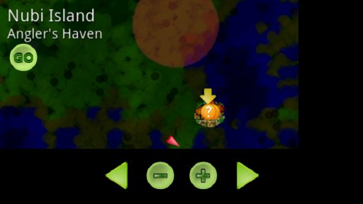
And we see our golden question mark down in Angler's Haven. We could walk there, but this village turns out to be a teleport destination, so we are offered a GO button, which we press
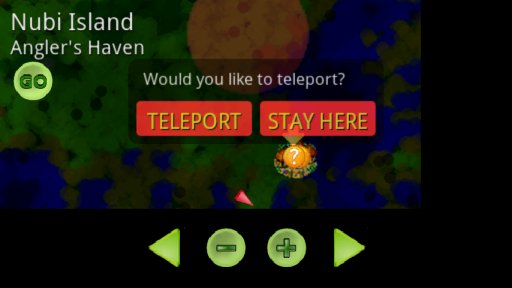
Upon our arrival in camp, it is easy to find the Fishing Master, both because of his golden dot on the radar, and the large golden question mark over his head..
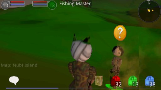
To collect our reward, we need to talk to him again, so we make sure he's the selected target and then tap the chat button again.
He is happy to see us!
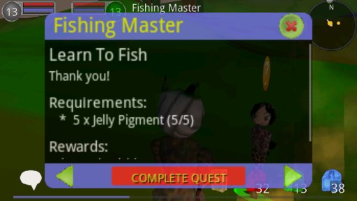
We press the COMPLETE QUEST button to collect our reward and this quest is done!
Being an RPG, he will probably offer us yet another quest, as he is unable to do anything for himself and has become a needy weak sister! (obscure movie reference, not sister-bashing!)
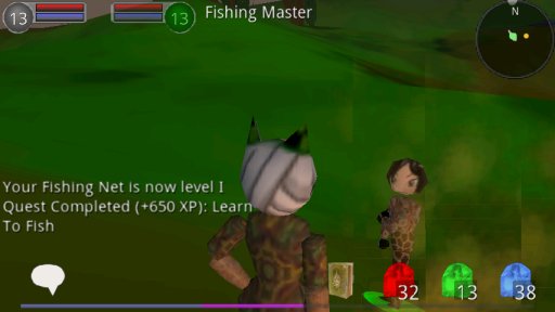
And that's how you do a quest!
Options
From the android menu key, select OPTIONs to open the options dialog
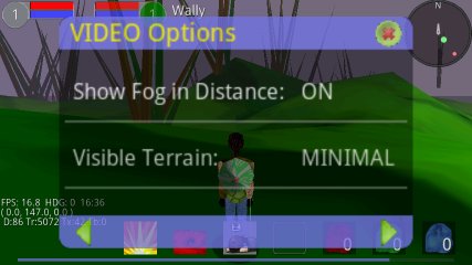
The left and right arrow keys at the bottom select between different option categories: GAME/VIDEO/AUDIO and DEBUG.
Video Options are generally about turning down the graphic complexity in order to get a better frame rate on your phone.
Audio Options are generally about not irritating your neighbors.
The Debug Options are there for my development convenience, but feel free to mess with them. For example, turn off WATER and see how your frame rate is affected.
Debug Display
OK, so the nerds in the audience want to know what those debug numbers in the lower left are: (These only appear if you enable "Show FPS" in the Debug Options)
- FPS (frames per second)
- HDG (your character's heading, in degrees, 0 = 'north', 90 = 'east')
- HH:MM the current time of day in game (a full take passed in just a few minutes, with the sky color changing to match)
- (x,y,z) Your character's location, in meters, on the current map. (Y is 'up' (elevation))
- D: number of Open GL 'draw' calls per second.
- Tr: number of triangles drawn per second
- Tx: number of textures bound per second
- Tb: number of textures 'uploaded' per second
There's always a trade-off between performance and appearance. I would really like to get 30 fps on my Droid, and 15fps on the lowest-end phones that can play the game at all. But sadly, that's not yet the case.
-----
First off is the development of the engine (yeah, yeah, why re-use someone else's really GREAT engine, when you can make your own lame one from scratch!)
My general plan of attack is:
- Terrain
- Characters
- Battle
- Storyline
As I write this, I am about a week of noodling into the Terrain engine.
I will just document this by adding some screenshots showing the evolution. This first picture shows first light of my textured Fractal terrain heightmap. The main thing here was to learn the GLES dialect available in Android (currently I am using 1.0, which has only a single texture stage, which is thus influencing the design)
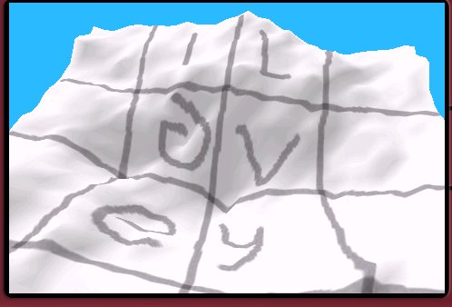
The secret encoded Runes are a message for my lovely family, for their support, encouragement, and great ideas!
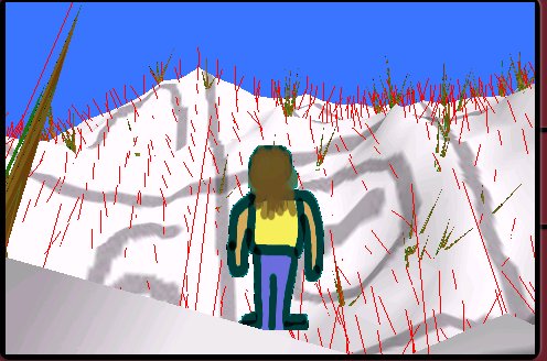
This next image shows the first visualization of the terrain normal vectors. You can also see an early version of 'Trees' in here. The little placeholder character will NOT appear in the final game (I promise!). I was just working on the code for 'standing on the terrain without sinking into it' and I needed something to test with. These normals were not particularly good. I don't know about other 3D programmers, but it always takes me several tries to get my normals right, and it always requires some sort of visualizer to really see what's going wrong. Note that at this point, the sink-to-ground code was still defective, so most trees were just poking through from deep in the snow.
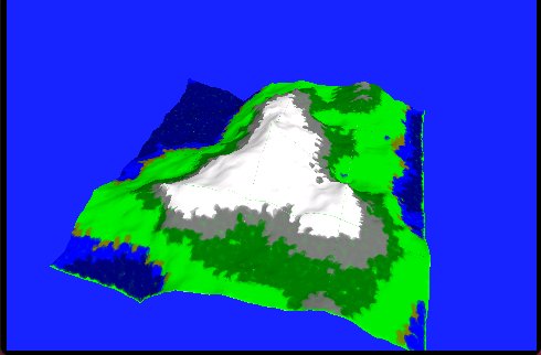
This next image shows an early version of my "Algorithmic Terrain Texture" generation. Basically that means I have to create a suitable image to paint on top of the heightmap. This example shows the general idea of 'altitude selects terrain type' with the types being deep-sea, shallow-sea, sand, grass, forest, rocky, and snowy.
This looks reasonably good, but has large areas of solid color, which are not interesting to walk around on. Normally I would think in terms of adding some Perlin Noise in a second texture stage, but as mentioned before, that is not offered in GLES10.
Also notice the bad color along the edge. I haven't actually fixed that yet, but will need to eventually since the map is designed to be 'tiled' (wraps around on itself, to give the illusion of a continuous, repetitive, terrain).
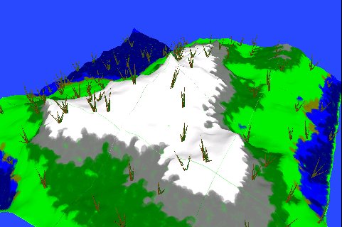
Here is the same thing, with the 'trees' which are now nicely sitting on the surface. But are gigantic (the map is 2Km across, so those trees are like 50m high.) The little character stand-in is similarly huge at the moment.
Here we see a small improvement in the Terrain Texture painting, which adds some appealing micro texturing. Note the bit of ocean on the right. Eventually I will have a sealevel water texture that will make that look better (instead of just showing the seabed, bereft of water). Here the little man is actually standing at the tip of a minor mountain peak, looking at a major peak in the distance, and the ocean down below.
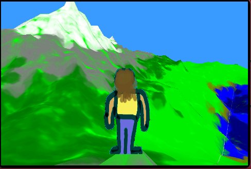
Here we are standing on the dome of a snowy mountain looking at a nice mountain skyline in the distance. Note there is variation in the texture right at our feet (not a solid color). This would look better with the perlin noise, but I am pretty pleased with it so far. And I think this is the sort of cartoony 'art look' the game will ultimately have. I am hoping to maintain a sort of 'brush-stroke' appearance.
Add a little fog and I think this would make a nice place to fight some monsters!
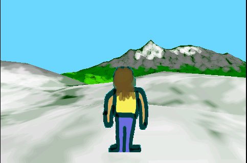
Here we have walked forward a little to the edge of the 'dome' looking down on a green valley between us and the distant peaks. At the risk of sounding apologetic, this looks 'even better' in 3D :-)
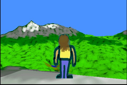
So, while that is not 'done', it is enough to prove the concept. This will be an 'adequate' environment for questing, though it needs lots of TLC, more flora, buildings, ruins, etc.
But I'm tired of looking at the little 2D man, so now it's time to see if I can have animated 3D characters with enough flexibility to actually fight each other.
I decided I wanted to do as much as I could algorithmically, with a small amount of control information generating as much content as possible.
I knew my characters, for example, would be formed by a skeleton of bones (hip, knee, ankle, etc) and that I would need a mesh to glue to each bone (upper thigh, lower leg, foot, etc.)
And so I thought I would try making a 'primitive generator' which given some control points would make a mesh for me. Here's an example of the first mesh it generated.
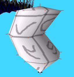
The control information is a 'line' of 3D points (5 in this example) and a 'radius' for each point (first and last points are forced to radius zero). The primitive generator then creates an N-sided 'oval' at each control point, and connects the verts and makes triangle faces and applies UV coords. And makes normals.
I figured this would work for arms and legs and such, but I have found it is actually considerably more powerful than that. I added a second radius per control point so as to form the oval (instead of always a circle) and some scaling controls.
Bottom line is I can make a reasonable skull with about 20 numbers. Not a GREAT skull, just a reasonable one.
So, that gave me the ability to generate little body parts, but I needed a Skeleton to glue them together to make a single, posable, body. That turned out to be extremely easy, given my low expectations. Here we see my first skeleton with just hips and legs.
I also started my algorithmic walk animation at the same time. So these legs will wobbling like a couple of beckoning rude fingers.
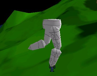
I didn't realize it at the time, but I had reversed my UV mapping, so I mistook the right leg from the left, and ended up doing my entire walk animation backwards. Then I had to rewrite it, and the good news is that it got better.
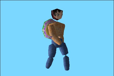
I added some more limbs and then thought about 'attachments' (for example the shield on his back here.) I'm pleased with my minimalist attachment API. It's basically just a dynamic extension to the same skeleton object. Attachments get a mesh (made with that same primitive generator, but it doesn't HAVE to be) and are attached to a skeleton bone, with an offset and an orientation.
Here's a back view of that shield. I was pleased to realize the primitive generator could make a spikey shield in about 9 numbers. And it is concave on the other side, which I also did not plan ahead for. I love serendipitous moments. Less is more.
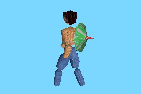
Obviously that doesn't look GREAT, just PROMISING. In the final game, characters will be very small, so too much detail will actually jusr be wasted effort (I tell myself).
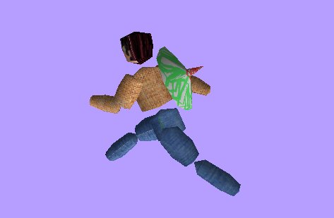
And here we see another moment of the walk/run animation. I eventually gave it an 'intensity' scalar that lets the same animation work from a slow walk to a fast run. Obviously it's not as beautiful as a manual artist-provided animation.
But I think it's the best dang walk animation in the world anyway :-) Shame about the ugly limbs and missing body parts though.
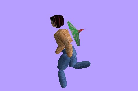
But check out this leap!
After that leap, I just had to give him some nice italian shoes and black leather gloves. And why not a nice sharp blade to hold in that hand!
I also cleaned up the legs a little so here it looks a bit more like he really is wearing blue jeans. His upper body is still comically over-exercises. You can see the inklings of his anime hair.
Those white lines are in the texture image, just to help me see if things line up. None of this is intended to be final game art, of course (but we'll see...)
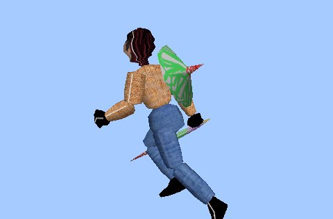
And here we see him running towards us. What a classic pose! And I didn't even cheat it, this is just a random moment from the run animation. Wewt!
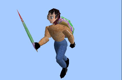
I was ready to go to bed, so that sword is just 5 control numbers, when a NICE sword would be at least 20 :-) But it's nice and sharp (very skinny, edge-on)
I also re-used my texture scribble I did for the shield. But let's pretend that is blood on the sword.
I spent some time trying to make a better skull, and, well, it needs a lot of work, but I now have 'a system' so it will be less random next time. But it has a lot of 'character' this way, so it's not necessarily bad.
To give you an idea of just how lazy I have been with the textures, here is the texture for the skeleton
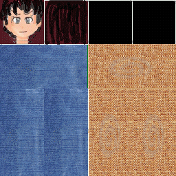
And here is the texture I am using for both the shield and the sword
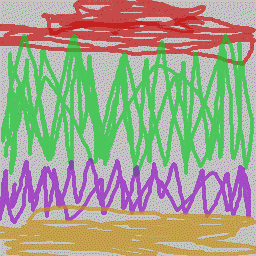
So given that, you can see GL improves things :-)
Anyway, I think that's my proof of concept that I will be able to have characters and monsters. I need to make at least one monster skeleton, and some more animations (attack, defend, damage, die) before I can try out the next benchmark... COMBAT
This requires the implementation of the 2D overlay support (for life meters and action buttons. Here is a First Light image on that
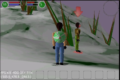
So here we see my life meter (the left) and his (which disappears when nothing is targeted). This is a randomly placed monster, as I still need to implement the 'Hive Manager' (who will spawn monsters near me as I walk the map, and stow monsters too far away to interact with).
For targeting, I was originally going to do the normal 'click on your target' but on android it is so easy to click (by accident) on random locations, I was afraid that would make you lose your selection in mid-battle. So instead I automatically keep track of the N closest potential targets. Then if you have NO target selected, I pick the closest one automatically.
But once a target is picked, I won't change it automatically. However, if you tap the target's life meter, then I will step through the available targets. And, I admit, android makes it JUST HARD ENOUGH to do 3D 'picking' that I am glad to have thought of an excuse to avoid it :-)
The targeted object gets a red shadow AND a red arrow over his head. (and a boost to his ambient lighting). (Rocket Club fans will notice the similarity :-)
Along the bottom you see ten "Flex Buttons" which is where your actual battle actions will go (spells, attacks, buffs, etc). The idea is that the game will offer a set of actions (which increases as you level up) but none/few of them are automatically bound to a button.
To bind an action, I think I will have you long-press the flex button you want it on (hold it down for a second or two) at which time I will bring up a page showing all available actions. That page might also act as documentation of what the actions do. Anyway, then a long press on an action on that page will bind it to the flex button.
You could bind the same action to multiple flex buttons if you liked (you wouldn't want to, of course, I just think it's neat that action and button are nicely separated conceptually :-)
Also new at this time is Time of Day, which in PLAY mode cycles over a four minute period (I assume ultimately I will let the current Chapter control time changes). Anyway, so the lighting and sky color changes over the course of the day. There is a little clock in the debug window, so we see it is 7:14am and the sky is a light violet, coming out of a sunrise.
I'm not super pleased with the colors yet, but that's the life when you're doing things algorithmically. The color is entirely algorithmic, and my algorithm is not as great as I would like it to be. It's loosely based on real physics, but since the whole sky is a solid color, it won't really look all that great. I need to make a real skyDome with vertex coloring to make a truly great sky. And that's not a priority yet.
----
I refactored my Hive Manager so now I have 1000 monsters on a single map, with barely noticable lag (because I only spawn the ones close to you, so there are really only four or five around at a time normally). Sort of a Virtual Monster paging system :)
But the MAP gets to place all 1000 of them (I actually tried 8000, but that did cause some lag).
A single map is a 2Km square (that will wrap infinitely) and takes about 2 minutes to run across the length of.
Anyway, right now the monsters are still spread around randomly, and I only have the one 'model' which I use in several sizes
And the NPCs now have their beginning AI, Here we see a couple shots of them wandering around (they 'patrol' until they smell an enemy). It was a moment of jubliance when they correctly used their walk animation when walking, and their breathing animation when stopped.
At night.
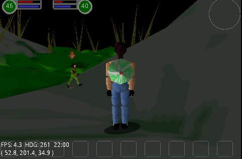
In the day. Basically each monster is assigned a patrol position and range. He is then free to wander around inside that area, using whatever rules he likes (he might avoid water, for example). If my aggro attracts him, he will engage me and then he is free to chase me even outside of his patrol range.. up to a point. After that, he has to break off attack and return to his range (and until he gets closer to his patrol 'circle' he won't engage anyone.
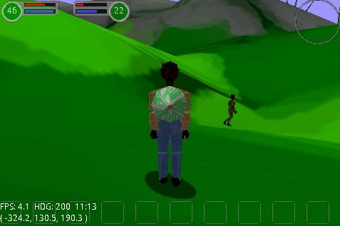
Here a little monster smelled me and ran up behind me and started poking me. They are already obeying a little bit of rules (can't just slash constantly). Note also that they run up to a spot NEAR me, as opposed to right on top of me. They feel reasonably alive already, though the animations are still a bit wooden.
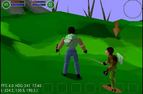
And here one of his pals has joined him. You can actually see him in the distance in the previous shot (behind my left hand). It's a little scary when you see him realize you exist and watch him run up to you. The fact that his patrol speed is one rate, but then he actually RUNs to attack you, gives the illusion that he has some emotional content.
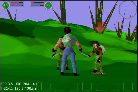
I'm still getting about 30fps on my droid (but less than 4fps on the emulator -- which is doing software rendering of the 3D). It looks better on the droid, as well. I have reports of considerably lower frame rates on some phones, though. Probably a combination of my code and the phone being a bit underpowered for 3D. Hopefully I can improve the code, if not your phone :)
So I just need to add the actual damage, and a concept of death (and give myself an attack button!) and I can check of 'Battle' as being proven feasible (if not 'done') and move on to Story.
But I think I need to step back a little and do some cleanup, like figuring out how to do nice camera controls.
Plus I have to tile the terrain, clean up the trees, add ground cover (bushes), etc.
Oh, and my algorithmic 'ruins' generator to get some man-made 'flora' in the scene (the occasional hut and castle). That raise the issue of collision detection (currently you only collide with the ground, and structures imply wall collisions and floor collisions, as well as nasty camera issues should a wall get between you and your characters) I'm not in any hurry to do that. I'm not sure how much better that makes the game.
It's about time, so I added runes this weekend. Basically there are eight types of rune stones. You obtain the primary stones (red/green/blue) (aka ruby/emerale/sapphire) in the normal course of events: fighting, fishing, and farming (the three Fs!)
the second order runes come from "rune weaving" which is a skill you acquire (and hone). So when you're good enough you can make yellow, aqua, and purple runes by combining the primary runes appropriately.
As you skill up, you get better at it (otherwise, it can fail, just leaving you short two runes)
Then later, you can weave three runes (yellow, purple, and aqua) into a diamond rune (that's the coolest one, of course)
There is also the black (onyx) rune (or maybe coal rune to be more mirror with diamond), but it's special. You earn a handful of black runes every time you level up and you 'spend' them to boost your stats (Stamina, Strength, and Wisdom)
You can 'eat' the primary runes (they take the place of potions in the game. Using a red rune recharges 1/3 of your HP, for example. blue for MP, and green will be some sort of stamina buff)
The other use of runes (other than unlocking various quests and such) is on your equipment (weapon, shield, and helmet). Each can hold a single rune. You then cause additional 'color damage' (or have additional 'color armor') based on the color of the rune you use.
So you probably will want to equip everything with diamond runes so as to have all 3 colors active.
The battle math basically does four similar computations to determine four different damages (normal, red, green, and blue)
(red is fire, blue is ice, green is nature... to be determined.. probably a rock/paper/scissors relationship)
anyway, a particular blow might generate 10 points of normal, 3 points of red, no green, and 1 point of blue damage. I then add the positive values together and you lsoe 14 hit points.
Anyway, the UI is working now, with action buttons that dim and have timeouts appropriate to the 'spell'
No matter which weapon type you choose (sword, mace, wand, staff, bow...) you have an automatic 'melee' mode which happens whenever you are close enough to a monster (magical melee is something like your wand spitting energy every so once in awhile). The point being that melee just 'happens' (as in a real time strategy game when units are close)
Then you have three attack buttons (everyone has three attack buttons... this is a SIMPLE rpg) which are basically:
* do a really big hit on one guy (5 second cooldown, costs mana)
* do a medium hit on everyone nearby (3 second cooldown, costs mana)
* do a medium hit on target, and 'stun' them for a bit.
That list might get some refinement, but remember this is mainly a solo game with you alone in your party, so you are the tank, and the range attack, and the healer, etc. So every character can do everything to some degree (you can all eat runes, as it were)
And no, you probably aren't literally EATING them.
I'm still toying with some attack that actually consumes a rune to perform. I want a small number of truly interesting and unique actions, as opposed to a large number of very similar to each other actions. Android is not friendly to having a million buttons. And I am not yet willing to say "use gestures to 'cast' your spell"... though I am not averse to the concept.
Anyway, the title feels more honest, now that there are some runes (well, I CALL them runes... no actual glowing runes yet)
So, here is the 'final screen shot' of Battle
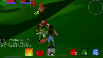
It supports all the normal stuff. HP/MP, multiple attacks, melee battle, health potions, experience points, and levelling. The usual long list of things to clean/polish/improve, but I can now officially begin...
Story
So, I know I want to have my long term vision set on story being 'easy to create' and 'extensible' but I also want to keep the project small and focussed.
I don't know if I already said this or not, but I would like WoS:RR to be to a full RPG, what a tower defense game is to a full RTS.
A tower defense game (which I love, by the way, Tower Raiders Gold for android being my favorite) basically just takes the "build your base" element from a game like Command and Conquer, and that's it.
I admit that the whole 3D aspect of WoS:RR is a bit of a distraction from that master plan, but I am hoping to make up for that by keeping the complexity of the RPG low.
When you buy WoS:RR, you are buying "a book" which consists of multiple "chapters" and your character starts off in Chapter One (well, more likely in Chapter - Zero, the tutorial). And if I ever have any business sense at all, that will be it. And the second "book" will require you fork over another $1.99 and will appear to be a completely separate game (though secretly it will reuse the majority of the WoS:RR engine).
<Rambling Removed>
So, the first decision regarding WoS:RR is that I will implement the in-memory classes, but they will initially be loaded from source code and not external meta files. This will allow full development and still leave open the possibility of future extensibility.
Having said that, a Book consists of several parts (appendices, metaphorically):
- The full list of characters/monsters to be encountered. Their names, their appearance, their behaviour. And for those which are fight-able, their level, favorite spells, etc. To the degree this could be made hierarchical, it would be nice to create a "Great Shark" which inherited most of its stats from a "Pathetic Shark"
- A full list of possible Quests (with each quest having a unique ID number). Where for each quest you have a name "Return to the King", a description, "The dragon's toe-nail must be returned to King Fremel immediately, as only by analyzing the fungus upon it, will we be able to determine in which of the mystical floating forests the dragon is hiding.", etc.
- A set of map definitions, where each map has a name, a random seed for its fractal height map, and 'location hints' to make sure it has the required bodies of water, mountain peaks, ruins, castles, huts, weather, etc.
- A set of Story Segments. These can be thought of as cut scenes, hopefully rendered as 'cool' cinematics, but if nothing else then as a series of popup text bubbles and scrolling text narration. Basically while the quests are non-linear (except when one quest specially follows another), the storyline is linear. Story segments are basically handed out as quest rewards. (Not every quest provides a story segment). And while I say 'linear' that is not to say you couldn't have a deviation based on character class, or choices made over the course of the game.
So, as of Release 20, WoS:RR now has a quest system (but not a story system yet). The Book can define maps now, with hints. So a map is still a random fractal surface, generated from a single seed value, but that seed value can be provided along with height hints to define a repeatable map.
For example, this definition:
id = MAP_ID_SELECT;
mMaps[ id ] = new SpecMap( 1234, "Nubi Island");
mMaps[ id ].mHeightHints ="WWWWWWWWW" + // 0
"W.......W" + // 1
"W..GGG..W" + // 2
"W.G.F.G.W" + // 3
"W.GFFFG.W" + // 4 center
"W.G.F.G.W" + // 5
"W..GGG..W" + // 6
"W.......W" + // 7
"WWWWWWWWW" // 8// QVMs on this map
mMaps[ id ].mQVMs = new float[]
{ QVM_ID_WALLY, 10, 1, 10 };// Monsters on this map
mMaps[ id ].mMonsters = new int[]
{ MONSTER_ID_RUFFIAN };
Creates this map:
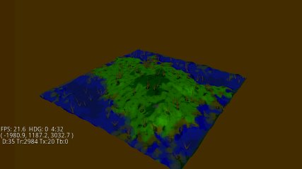
and also places NPCs (QVM = Quest Vending Machines), monsters, etc. The QVM table declares which quests are offered by each QVM. The Quest table describes the actual quest, including its description, requirements, rewards, and turn-in QVM.
Wally's quest definition looks like this:
id = QUEST_ID_WALLETS;
mQuests[ id ] = new SpecQuest( "Basic Mugging" );
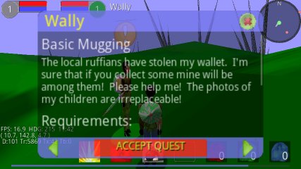
mQuests[ id ].mDesc = "The local ruffians have stolen my wallet. I'm sure that if you collect some mine will be among them! Please help me! The photos of my children are irreplaceable!";
mQuests[ id ].mTurnInQVM = QVM_ID_WALLY;
mQuests[ id ].mReqs = new int[] {
TROPHY_ID_WALLET, 10,
MONSTER_ID_RUFFIAN, 5,
REQ_RUNE_GREEN, 1,
};mQuests[ id ].mRewardItems = new int[] {
Items.ITEM_ID_GOLD, 100,
Items.ITEM_ID_PURPLE_RUNE, 1,
};
Anyway, the goal is for a small amount of content definition to turn into a large amount of content in world. Obviously, the above is the bare minimum and will presumably get more complicated over time.
But here are the recent pictures: (see the How To Play section for more). We talk to Wally and he offers us a quest, the description is 'scrollable' with our finger. We accept the quest
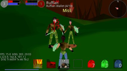
We kill Ruffians and collect Wallets
We eventually meet the quest requirements, then use the map to find where to turn it in.
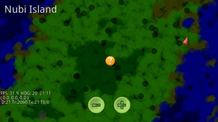
The red arrow is us. The Golden badge is Wally (or at least it's someone to whom we can turn in a quest)
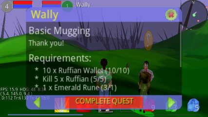
Wally is happy, press the COMPLETE button to collect your reward (and probably get a few more quests from lazy Wally).
Note that the Compass (upper right circle on main window) shows baddies as red dots and friendlies as yellow dots.
And right now, tapping the name tag is how you talk to a character. They will either open a suitable Quest Dialog or just engage in appropriate banter.
You can close a dialog either by tapping its red X (upper right), or using the android BACK button.
I guess it makes sense to switch to a release note format for ongoing status reports... newest one on top.
This is yet another release where most of the changes are behind the scenes (and more likely to have broken something that worked before than to be a noticeable new thing in the game) But that's how development goes, what can I say?
The details:
- * new model and textures for "bird" creature (used for your flying mount).
- * massive changes to texturing system which hopefully you won't notice. But you WILL notice that your existing clothing will probably have changed. In particular your shoes and gloves, but other things as well might have changed, depending on what you were wearing. The Big Change is that now indivual textures of your outfit all come from separate (and smaller) image files, instead of all from one big one (with a lot of redundant pixels)
- * new model: pumpkin. Dunno why. Every game needs a pumpkin, right?
- * new MAP: "Infinite Desert" sporting a new terrain coloring palette (desert-y)
- * new LOCATION: "Farthing's Folly" (arrival location for Infinite Desert)
- * Changed the terrain painting system to support per-map control of the palette.
- * Weapons now get invidual names (so instead of "Wand IV" you might have "Dragon's Tooth"
- * NPC chat system has more %words, so they can call you by name, class, race, etc.
- * I now support something called an 'outfit' which is basically used to dress NPCs more efficiently.
- * NPCs have all be re-dressed
- * Now support WINGs (more or less, still no great wing flap animation while flying)
- * Texturing is now hierarchical, so I can make a new monster based on an old monster and get both the skeleton and the texturing hierarchical, with piece-wise overrides
- * New SKELETON: bird
- * New MONSTER: Parrot (oooh, scary)
- * New QUEST: (to learn the portal to Infinite Desert)
- * Reworked the armor and weapon quests
- * Reworked the TAIL system (to take advantage of new texturing)
- * Now have 2 tail style: cat and dog, but everything now uses 'dog' at the moment
- * TOON mode now supports simple camera controls (zoom and orbit)
Truth of the matter is that between the holidays, my back hurting, and Kathy's shoulder surgery, I haven't been able to sit at my pooter long enough to get much work done for awhile, but I cleaned up some pending changes and give you RR35. Let's read the diffs together and see if there is anything exciting.
- * New models added. Barrel, Campfire, Crate Stone column, Guard Tower, wall segment
- * I fiddled with the scenery a bit, so all locations are not completely identical any more.
- * Sea Mount quest now has its own boss and area to fight for.
- * Mount Quests now have minimum level requirements
- * Quests that require collecting runes and gold, now actually CHECK FOR and REMOVE the required items
- * terrain system now has 'bumpiness overrides' so a LOCATION can demand a bumpiness change (specifically this allows something like the Mount Diable base camp to generally flatten the area around it.
- * New location (Mythos Deeps) where boss Ikthos hangs out
- * Reorganized the hierarchy so that TROPHIES now have a list of MONSTERS who drop them, instead of MONSTERS having a list of TROPHIES they drop. A Pain, but I feel better about it this way, and it makes quest authorship slightly easier.
- * Added support for higher resolution Map elevation hints. Brand new map for Mount Diablo, subtly new map for Nubi Island
- * NPCs standing around are now distributed between the available races, instead of all being k'nin
- * runtime validation of BOOK ensures I don't release 'unplayable' quests (e.g. a quest that demands a TROPHY which is dropped by no MONSTERs)
- * Monsters will no longer continue biting you, if you enter a tutorial. So you should feel no sense of urgency to close the tutorial prematurely.
- * reworked the battle 'damage economy' (again) in an effort to keep striving for this "maps never get trivially easy' goal.
- * fixed a bug in the handling of equipment with runes equipped, that made said weapons much too powerful
- * created a second particle system so that 'important' particles (weapons fire) no longer competes with 'environmental' particles (campfires) to the benefit of both. (mainly it looks nicer when you have multiple campfires now). This also fixed a bug in the particle emitters where they would reduce their output prematurely.
- * fixed a bug in the fractal surface generator which could allow stitching errors at tile wrap boundaries. (dumb error)
- * Increased tutorial text resolution so it is not quite so horribly blurry. Might have broken Eris support in the process (if out of memory)
- * Fixed an odd ALPHA bug in the enemy life meter
- * added sound effect for closing tutorial text (comforting on slower phones)
- * redid the mechanics on how I paint the terrain textures. No obvious difference to be seen (I hope) This is so I can later support per-map "palettes"
- * fixed a null pointer crash (reported to me automatically from Android Market, cool!)
- * Switched MIN filter for UI textures, which should make the UI crisper looking overall
- * Script Engine can now execute up to 30 opcodes per step (instead of just one), makes scripts (mostly tutorials at this point) peppier.
- * Increased particle density (might have to add a particle option for slower phones)
I guess that's enough goodness to not feel too embarassed. I had hoped for more monsters in this release (in particular, an avian monster. I designed a nice quest for getting your AIR mount, but it won't be in this release)
This is mainly adding a bunch of Tutorials, but there are some other changes as well:
Here are the bullet items:
- * Fixed a coding laziness where I hardcoded 'threatLevel' values in a million places instead of using nice #defines
- * Added the second Official MAP ("Mount Diablo")
- * Added a location (Land's End) to the Nubi Island Map
- * Added an NPC at Land's End who teleports you to Diablo when you qualify to join the forces there
- * Added an arrival location at the base of Mount Diablo
- * Maps (and locations) now have "Difficulty Levels" which make them more or less difficult, relative to your current level.
- * Maps (and locations) also
have 'AbilityRatios' which are just another way I
can tweak their relative difficulty
(note that carrying a weapon, especially if equipped with a rune, still makes you overpowered on the map)
- * Added three new "Set" pieces (for camps): Tent, Monolith, and tombstone.
- * 'all' locations now have a slightly fancier set (but still all the same)
- * Added support for Set
Piece 'rotations' (3 axes) relative to the
current Set, which can have a relative heading
rotation of its own (1 axis). So tombstone can be
tilted back a little, for example, and Monoliths
can be at crazy
angles.
- * Added a total of 10
Tutorials, triggered by various actions. There is
still a pretty long on at first incarnation.
But once you have played a tutorial all the way to the end, you get credit for it (and earn some XP) and don't have to
see it again (on that character).
- * minimum character level can now be a quest requirement, as WELL as a quest pre-req. (i.e. you can now have a quest which gets accepted at level L1 and completed when you attain level L2)
- * Reworked the existing Equipment quests to have level pre-reqs that make sense
- * I now officially hide maps (on the MAP panel) that you shouldn't know about yet
- * Reworked the way the Hive determines monster/NPC/Boss levels when spawning (in keeping with Rune Runners "no monster ever gets COMPLETELY trivial to you, while still allowing some monsters to be harder than others)
- * Fixed a bug where NPCs/Bosses were picking up some incorrect values
- * Monsters now get ability points, just as you do. You no longer have that advantage over them
- * The Red Arrow over your current target will now "bounce" when you are within weapon range
- * Texture Resolution now
defaults to HIGH (since most people will prefer
that)
* Fixed a bug where a drop from a monster could be erroneously applied to more than one quest waiting for it. (sorry! :-)
- * Added an explicit measure of the DPI (dots per inch) of your phone's display *unless it lies!* so motion gestures should take the same distance no matter what your actual screen size/dpi is. THis should make table users happier.
- * Fixed a bug (I hope) where the clipRect would get set funny (not by me!) and result in the life meters graying out.
- * Tapping the CHAT button to talk to an NPC will now halt your motion as well.
- * Reworked the buttons on the MAP screen
- * added an 'empty socket' graphic to the STATs panel (for equipment runes)
- * fixed a bug so MAP opens to show current map (teleport was not resetting the map id)
- * MAP definitions from 'ascii hints' now support multiple 'resolutions' depending on how much a an ascii freak you are :-)
- * And, the most amazing
thing of all, Rune Runner now has a 'Rating' of
'Pre-Teen' in the android market (mild animated
violence).
This is mainly a 'behind the scenes' update with not a lot of obvious changes. The lighting model is actually much better, but you have to just take my word on that. The big change is the introduction of the "Story" engine (as opposed to the "Quest" engine) which allows overaching story elements to be composed in a simple scripting language. But the only Story included in this release is a simple Tutorial for new characters (well, ALL your characters will be given the tutorial once, no matter how old they are).
- * New script engine for 'Story' with a handful of opcodes (like the ability to autopilot your character, lock the buttons, etc.)
- * ability to have a Quest be a 'story quest' (runs a script, instead of the normal quests).
- * First story quest is a simple Tutorial the first time a character is played.
- * Story script can cause UI elements to 'blink' (to draw attention during the tutorial) but the blink is now a nice alpha fade instead of a total pop on/off.
- * Runes rendered in the UI are now slightly transparent (more like crystals, less like rocks)
- * Count values on buttons (like 'how many red runes you have left') are now a smaller font, looks nicer.
- * Teleport arrival is no longer right inside the campfire :-)
- * Quest Turn-In QVM now defaults to the original Quest Giver (since that's what 99% of the quests want)
- * Your camera zoom is now remembered between sessions (from now on).
- * Fixed a bug in the melee distance calculation which left you standing (and not fighting) if the monster thought he was within distance, but you didn't.
- * Changed the way distances were maintained and LODs were calculated to be more efficient and reliable.
- * Teleport destinations can now also provide an arrival heading
- * Story Script can (temporarily) disable Aggro (preventing monster attacks)
- * Normals (for MilkShape Models) are no longer getting erroneously scaled (models look much better when light hits them as a result)
- * New OPTION: Level of Detail (let's you make characters 'lod out' sooner, to boost performance)
- * New OPTION: Enable Elvish (brings the Elvish module back on line. defaults to OFF for a new install)
- * Removed obvious 'frame lines' from Particles and Shadows.
- * "Large center screen Error Text" is now configured for 'four lines' of messages (was '2' before)
- * Cleaned up some veil transitions while giving the Story Script engine control over the veil.
- * Dusk and Dawn are a little brighter than before (still pretty dark, though). Campfire light is still a bit weaker than I would like (but not the Epilepsy-triggering blink it was at first go).
- * Reworked Sun Position a little
- * Changed the UI for forward/backward motion a little (to work more reliably on phones of differing screen dimensions)
- * Fixed an old bug in the 'camera heading angle lerp' function so the camera no longer snaps 'the long way around' when changing your heading through certain key angles
- * Fixed a crash which occured if you deleted your last remaining character. (Thanks for noticing, Dave!)
- * Reworked Terrain Painter to support per-map palettes (though 'both' maps still use the same palette at the moment)
Yeah, not a lot to really be seen, just an infrastructure checkpoint release.
The story engine will be a big deal eventually though. I wrote the shells of about 40 quests this weekend, of which at least a few should show up soon.
I think I brought this web page into alignment with the current state of the game, and freshened most of the screenshots as well.
A few big ticket changes, and a lot of small change...
The action buttons have been reconfigured and there is now the concept of 'buttons which are appropriate for your current target selection). So the three fight buttons are now gone, unless you have targeted something 'fightable.' This allows me to have special buttons appear when you target a friendly NPC.
And the first such button is the 'chat' button which replaces "tapping on the target's name" as a way to see the quest dialog. (I lie, you can still tap the name. But that's now an EXPERT feature -- and the only way you can 'chat' with a moonster). But the prominent chat button after selecting an NPC should make it more obvious to newbies what they can do.
Eventually I might have actions which appear only when you select a dead monster (skin it?), or when you select something like a treasure chest? Or to start harvesting a plant (which will still be a fight, since I love that)
There's a new location on the main map, where you can find the 'mount master' who has (ez) quests to learn how to summon three different mounts (land, sea, and air mounts). You no longer start off knowing any mounts. Mounts now have special 'physics' such as:
- * land mounts can cross land or water, but slow down considerably when in deep water. (as do you when walking). They walk on the bottom of the sea (as do you, when on foot). You are never auto-dismounted from a land mount, and can continue to fight while mounted.
- * sea mounts can cross deep water at full speed. When moving forward they rise to the surface. In reverse they sink down. (they hold their depth if you hold still). You are auto-dismounted if you ride a sea mount onto land.
- * air mounts can cross anything at full speed. When moving forward they rise until they are at least N meters above the ground below them. Reverse pulls them down. You are auto-dismounted only if you land in water. You cannot fight on an air mount once you are a short distance in the air.
Gone are the "wand-users" and in their place are the "Classes" (player requested!), so now you see "Sorcerer" instead of "Wand-User", but otherwise all is as it was.
Gone are the stiff-as-a-board characters. When standing around, all characters (you and NPCs in particular) now will periodically change their pose, so as to appear more 'lifelike'
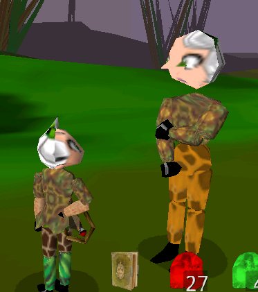
New GAME OPTION: Sunlight. This lets you specify whether you want the sunlight on automatic (where it follows the map's desires -- usually a 4 minute long 'day/night' cycle), ot to fix it specifically at DAWN/NOON/DUSK/NIGHT for your pleasure and/or visibility purposes.
New Feature: NAV POINT. (player requested!) When you tap on the map, you set a NAV POINT (that little arrow that has always been there). If you then return to the main screen, the current NAV POINT is shown as a white circle on the radar (along the edge of the circle if it is off-screen). Walk towards that and you will eventually get there.
Bullet Points:
- * minor art changes here and ther
- * Set pieces can now have Particle System Emitters. First use is a 'campfire
- * Particle systems can generate sound (campfire crackles when you are close
- * Particle systems can give off light (campfire illuminates things close to it
- * Actions can be made 'learnable' (i.e. you don't start off knowing everything
- * Quests can grant actions as a reward (for example, a tutorial quest can 'grant' you the Radar.
- * I can now make arbitrary UI elements "blink" (purely for the use of a tutorial to draw your attention
- * Radar now shows NPCs in 'gold' if they have quest interactions available for yo
- * New location has NPC with 3 mount quest
- * Every location has a simple Set now (the same one
- * Book can now declare 'boss' monsters on the map (they do not patrol at present
- * Quests can demand you kill a particular 'boss' (mount quests all have you kill the same boss.. once per quest :-
- * Simple set now includes a campfire AND a 'tent' (sort of a floating roof thing
- * Book definitions of Races now has an explicit 'gender' column instead of baking it into the race nam
- * Book definitions of Weapons now include a "class" definition, which is what you see now. So instead of "wand-user" you see "Sorceror
- * New Monster type "Giant Wolf" for the first 'Boss" monster (who is still trivial to kill
- * Jelly monster reduced a bit in siz
- * Technically there is a flying mount now, which works. But while it calls itself a bird, it looks just like the piranha at the moment.
- * Mounts really do increase your travel speed now (currently all 3 are set to a 25% boost
- * footsteps are no longer played while you are coming back down to ground after jumping in the ai
- * Not sure if new: Main action bar has a 'dismount' button when you are mounted
- * RUNE WEAVING action button has been moved from main action bar to STATS page (along with MOUNTs button
- * Default actions are now just four: questDiary, Red/Green/Blue rune consumption, leading to a much less cluttered screen
- * extra action buttons are only shown when you have a 'target' and then only the buttons that make sense for that target
- * played a game with the skill random number generator to make it feel more random
- * All Characters (you, monsters, NPCs) will now turn their heads (and waists, if needed) to track things they are interested in. NPCs are generally interested in YOU. You are generally interested in your current target. As are monsters
- * Fixed a bug in the hive which was leading to unusual NPC heights ("Wally, you're so tall!?"
- * Broke the huge water mesh into a bunch of smaller meshes, hoping to work around a bug in the OpenVR tiled rendere
- * cleaned up the material system so it is less black magic to work with i
- * rewrote the light system (removing black magic AND supporting multiple lights per scene
- * removed the paranoid calls to the garbage collector (which generally added one second delays which changing screens
- * new Game Option: sunlight" to control how the sun moves around
- * Generally dinked around with sunlight color/intensity values
- * New particle system type "Campfire
- * Set Piece system now has a level-of-detail for the whole set and the individual pieces
- * A quest reward can now include 'teleporting' you to a different location (which is mainly how new maps will be unlocked
- * quests can now reward with mounts, and action (buttons)
- * fixed a bug where monsters could drop the incorrect trophy (in particular, ruffians could drop wolf claws
- * CreateCharacter screen has larger buttons, with fewer false hits (I hope
- * Water looks different, when the camera goes beneath the surfac
- * Water should tile better when wrapping from one end of the map to the othe
- * STATS panel reworked to create an official area for 'second-tier actions' (WEAVE RUNE moved to STATS Panel
- * Characters now pick another character as being 'interesting' and keep their gaze on it
- * Characters now change their standing pose periodically
- * Quests can now formally specify how much XP they grant (as a percentage of 'what you need to level' and weighted by map difficulty. But map difficulty is still not set
- * You now must be close to an NPC to succesfully interact with i
- * Maps and locations you have encountered are now remembered (and will eventually limit what you see on MAP screen
- * Mount physics implemented (as described above)
The main changes in this
version are some new models and race names (and 'female'
options for each race). And the introduction of 'Mounts'
(Things you ride, that increase your travel speed and/or
options)
Changes
- * In this release there are two mounts, and you start out owning them right away (which won't always be the case -- eventually you will have to earn these as a quest reward). The Wolf is ostensibly for land travel and the Piranha is for water travel. However, in this release, they both go everywhere. After I add a bird monster, I will add a flying mount, which is what we all want. But first I have to implement swimming (need a UI for pitch that doesn't conflict with existing stuff)
- * To get on a mount, tap your health meter to open the STATs Panel, then tap the new 'horse button' in the lower left. This opens a dialog with a list of mounts you can summon. Tap the one you want, then tap 'SUMMON MOUNT'. You should then be returned to the game, and now you are riding something
- * Being on a mount does not interfere with your ability to fight, and fighting will not get you kicked off your mount. (Dying *will*, however)
- * To Dismount, click the new dismount button (in the same spot where fishing/farming button lives... you cannot fish/farm while mounted)
- * These starting mounts don't even give you a speed boost. They are just 'for show
- * NEW MONSTER: Piranha, lives only in the sea (but can follow you onto land if fighting you
- * Monsters can now have allowed elevation ranges, so the only monster you should see in the ocean is the Piranha. This will allow Yetis to live only at snowy elevations, etc
- * Your existing Characters' "Race" may change. The new race names are: "Narn" (human-ish), "K'nin" (doggish, "Purrn" (cat-ish), and "Grue" (which is still pending an update. Each comes in male and female, where the definition of female is the appearance of a modestly enhanced breast, and a small skirt fringe on the torso. Identical in all other ways.
- * (So, new skeletons for the new races)
- * diddled the terrain-generator a little to make smaller terrain triangles (to work around the OpenVR large-triangle bug. With some success, but can still have holes in the terrain when headed eastish
- * Five new Milkshape models (more than doubling the total :-) For Dog/Cat/Fish head and torso
- * When camera goes underwater, it actually makes a difference now (might not actually look 'underwater' to you, but it looks different - fog distance and color, water texture visible from below, etc
- * Changed sky color in create character Panel to something more sun-set-e
- * new 'dismount' button supersedes Fishing/Farming button (when you are mounted
- * new 'summon mount' button on STATs pane
- * STATS panel now shows # of quests you have complete
- * Equipment Rune "% health remaining" text now is colored to draw attention to almost-broken rune
- * New Animation (for your character while riding. Vaguely 'jockey-like')
Nothing helps you retain
your hair like a good tool. In this case the tool is the
"Memory Analyzer" add-on for Eclipse. This gave
me visibility into the Memory Heap so I could finally see
where the missing memory was going, and it was NOT going
into textures (as I had mostly proven to myself). It was
just being wasted foolishly by my not releasing some
arrays of floats and ints as soon as I was done with
them.
Anyway, since this finally makes the Eris crash-free. And
also boosted the frame rate from 4fps to 15fps (wewt,
that probably won't last, but wow.. actually a playable
frame rate on the Eris at last!).. anyway, since it fixes
a common crash, I am releasing this before adding the
usual pile of new crap :-)
What's New
- * Improved memory handling and increased frame rate on Eris-class phones. No more crashes on game launch (for Eris at least)
- * Introduction of book-driven "Sets". A Map has 'Locations'. Locations may now have "Sets". A set is a collection of "Pieces" and a piece is just some little model, and maybe a particle generator and a sound source (crackling campfire is a Piece. Campfire, stool, and tent is a "set") It's just eye-candy and I will have an option to turn it off (if needed, for performance reasons)
- * One set in the game... something lying on the ground at the center of Camp Ptomaine.
- * unified the Level of Detail stuff, so as not to have it in multiple places in the code (Sets needed it)
- * added some more garbage collection hints, including an important one at game shutdown, which should prevent "crash when I restart the game immediately after closing it"
- * Disabled TExt to Speech
for now. I did this to rule it out as a memory
issue, but I think I will leave it out for a bit
so as to rule it out as a crash candidate. I will
bring it back someday, as an option, and
hopefully more graceful that slapping you in the
face the first time you launch the game "You
must install Text to Speech!" (which would
make ME suspicious as a prospective player, so I
assume it makes other people nervous as well.)
This isn't actually released yet, I am just pleased to announce that I wrote a model loader for the MilkShape "ASCII 3D" file format, so now I can use MilkShape to create select 3D models (instead of always using the 3D primitive generator). And if I were a good 3D artist, this would probably be fantastic news :-)
Anyway, here's my first 'real model' in MS
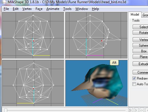
And a couple instances in world. The oversized head was a mistake, but of course in retrospect it's obvious that over sized heads are the way to go. So expect to see more swollen-ness in the future!
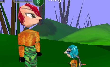
OK, now it is officially released
Officially, this is a performance
release, in the sense that it includes multiple changes
intended to boost frame rate, but probably not on any
phone that actually needs it.
Bullets:
- * bitmap size reduction. I continue to have memory issues, so this seriously reduces the sizes of almost every bitmap in the game, which should have given me much more memory to work with than before, but oddly enough did not have the impact I would have expected, if my memory issues really are associated with bitmaps/textures. But it's clear I can't afford to have very high resolution textures in the long run, so I might as well go on my diet now.
- * Can now import models made with MilkShape, my favorite shareware 3D modeling program. I include one such model in the game as the new character head model. Slightly less repulsive and actually fewer triangles than the original.
- * Two new monsters: "Jelly" and "Feral Prickle" (a feral version of the Prickly Pear you grow with the Farming skill). Currently these range over the entire map. They also drop trophies which now drive the Fishing and farming quest chains (it's not all wolf claws any more :-)
- * Two new skeletons (for the Jelly and the Prickle, of course). Per WoS standard, there will be lots of Jellys of different textures in the game.
- * I reduced the size of the Wolf a bit. Bigger is better (for visual), but gotta save the truly hige for big bosses
- * fixed a bug in the terrain incline hugging behaviour
- * fixed a bug in the Plant aging (it was not accurately reporting the age of your plantings, I mean)
- * Fixed a bug in the Plant Texturing
- * Walk animations are now book-driven, with Jelly's having their own walk cycle (for example
- * Monsters may now have a full-character alpha value (Jellies are translucent).. which means I could also do the trick of making close characters transparent (so as not to block the camera) On OpenVR GPU sets that will even work without my pre-sorting alpha objects by inverse distance.
- * I now maintain extent data for each mesh, making it easier to 'scale to fit' and find proper locations for hats.
- * FBO-Texture rendering. Since I am fill-rate limited in general, reducing the total pixels written by the GPU is one of the best things I can do to reduce frame rate. With jon's prodding I added support for a new option "Screen Resolution" which is FULL/256/128. in FULL mode I let the GPU render directly to the phone's full screen size, as has been traditional. In the other modes, I make a framebuffer object of that width and limit the GPU to rendering to an off-screen target (which is smaller than the phone display). In theory this is faster. Then I take the texture it rendered the scene to and copy it into the colorBUffer of the 'real' render (the full screen render) which then adds the fiddly UI bits on top of the pre-rendered 3D scene. (so text looks nice and sharp). Unfortunately, the technology used to copy the pre-rendered scene to the screen is also fill-rate limited, so I dont get as big a bang for my buck as I would like. And '128' mode looks pretty grainy.
- * New VIDEO option: Terrain Resolution. This sets the size of the bitmaps used to texture each of the 16 terrain cells. In HIGH mode they are 128x128, in LOW mode they are 16x16. The Eris pretty reliably runs out of memory after creating 16 128x128 bitmaps. (about a megabyte). This leads to a crash during game launch
- * Crash Detection and Recovery. I use a little trick with some nonvolatile variables to detect if the previous run of the program was successful or not. If not, then on the NEXT run of the program I automatically set the Terrain Resolution to LOW (and pop up a dialog telling you that). This change is temporary for that launch only, so you would manually change the option to LOW if it seemed that was the issue.
- * Lowered the font size on the OPtions dialog, so you can see more like 3 or 4 options at a time, instead of 2 or 3 (varies with screen dimensions) I think it's still pretty easily read and clicked (and that's coming from the blind guy)
- * added some hints for the garbage collector that it would be a good time to collect (after releasing a bunch of memory, or just before asking for a whole bunch of memory) It's free to ignore my hints, and probably does
- * Animation Mode now shows the buttons right away instead of only after the first time you try to tap them (was an odd bug). Tapping in the main screen area steps through all defined skeletons.
- * Slightly more efficient skeleton rendering
- * I lowered sandy texture to a little below sea level to minimize the amount of blue terrain above water. Terrain fractal map is still too low resolution to guarantee no blue above water. Might just come up with another sandy color that I use fairly deep into the water. I still have lots of other water work to do.
- * Tree shadow radii are slightly improved (mandatory fix once I added low-rez terrain painting)
- * Water render uses terrain mesh extent to skip water render for terrain tiles that are completely above sea level
This version has been reasonably thoroughly vetted on the Droid Eris, and has mipmaps support turned back on (well, it's now a "Video Option" and you can TURN it on, but it defaults to off, just in case)
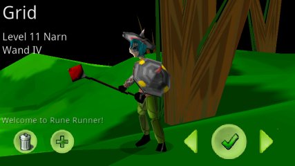
This version also introduces all four levels of all fours kinds of equipment. Here we see "Grid" sporting a hat, a gold-studded shield, and a very large Wand.
- Bullet Points
- * New art for swords, wands, helmets, shield
- * New models for swords, wands, helmets, shield
- * new sound effects for swords, wands, helmets, shield
- * wands more fully supported (still need custom animations
- * wand shoots a 'nicer looking particle' (still not great, but at least it has alpha now :-
- * footstep sound effects (I'm never sure if that's a good idea
- * various "Tada" sounds when raising a skill, completing a quest, etc
- * fixed some Garbage Collection issues (less GC required
- * Made the targeted character's name look more like 'a button' to encourage 'tapping it' (that's how you talk to an NPC
- * Book has two new locations "Potato Point" and "Angler's Haven" where you learn farming and fishing, respectivel
- * Fishing Net and Seed Bag are now quest rewards (you don't just have them from the get go
- * Shields, Weapon, and Helmet are all Quest rewards now, with 4 quests each (for the 4 levels) The quests themselves are still lam
- * New QVMS: Farming Master, Fishing Master, and Shield Master, of cours
- * More reworking of the Wolf skeleton/texture. Also he's kinda HUGE at the moment as an experiment in camera angle
- * Technically I could have 4 levels of fishing net and seed bag... we'll see
- * Now tracks 'known locations' and 'known maps' (i.e. counts how many times you visit each
- * 'unknown' locations no longer have a label on the MAP (??? instead) and their icon is very fade
- * locations can be 'regions' (and are shown as a lightly colored circle on the map instead of a village icon
- * 4 legged critters change their pitch as they walk on uneven terrain. looks nicer. Mostly all 4 feet look 'grounded
- * gravity now tracks when you are airborne or wading or 'swimming' (currently just suppresses footsteps :-
- * Attacking monsters now head for a spot 'in front of you, but not EXACTLY in front of you), again to improve battle camer
- * Levelling up in a skill plays a "tada" and generates a scrolling text messag
- * The large center-screen messages can now also scroll (4 lines
- * You get notification messages when you enter a location/region (and a tada when you 'discover' one for the first time
- * More aggressive Level-of-detail changes in an effort to reduce the total polygons rendered
- * Shadow manager can now generate unique alpha for each shadow (now uses vertex colors) so shadows can be vague, while arrow over target's head can be bright and sharp
- * I now re-use the previously temporary "ByteBuffer" objects used to pass vertex and texture lists to gl
- * No longer wastes time/memory building material structures that are not used
- * Fixed mipmap generation on Droid Eri
- * now formally pull the GL 'extensions' list from the 'card' (and check for supported features
- * New DEBUG option lets you suppress render of characters (including yourself) for performance checkin
- * Particle system now supports varying vertex color over the life of the particle (in addition to alpha and size
- * Finally re-did the terrain painting to not depend on a single huge texture. Should lead to fewer out-of-memory game launche
- * tapping buttons now generates a standard sound effec
- * Implementation of Fog was leaking memory, fixed
- * fishing is now allowed up to about neck deep in the water (below that and you start swimming.. except you don't.. but you will
- * camera focus/character position fixed on Select Character and Created Character screens (subtle
- * Select Character screen has a minor 'animation' when you switch between characters (they fall from the sky
- * SFX added for binding rune to your equi
- * SFX added for burning an Onyx rune to boost stat
- * Skeletons can have a 'default texture' in the Book (helps Toon mode not have the Wolf wearing jeans
- * Characters can now wear "Helmets" (boost your defense
- * Wolf now has custom attack animation
- * Fixed a bug in QVM placement which was masked before since the only location was at (0,0) [always check your work!
- * Now requests permission to write to SDCARD, still unused, but I think it's inevitable.
Yes, it went from RR24 --> RR27 in one go (versions 25 and 26 had to be aborted instantly since apparently Droid Eris doesn't support mipmaps, or not MY mipmaps in any case. so 27 has mipmaps turned off)
Anyway, so I didn't really MEAN to do a release tonight as I hadn't met my goals for the next release yet, but I foolishly thought it would be a quick way to test on the Eris (Trust me, hooking up the USB cable is much quicker and much less likely to cause the planet to hate you for publishing a broken version)
Luckily it's a small world for this game so far :-)
THE CHANGES
- * adds a bunch of sound effect files (wolf growls mainly)
- * adds the first cut particle system code, but no real particles to get excited over, except maybe ripples
- * wading in water now sends out "ripple particles"
- * Reworked the size of buttons on the "QUest Dialog"
- * Monster/Weapon sound effects are now "book driven"
- * 'Wand" now makes whoosh (instead of sword) and sends 'a particle' (red circle) to target
- * 'Wolf' now growls (instead of sword clanking) and is equipped with a 'tooth' weapon (not available to players)
- * Monster-to-map assignment is now based on 'locations'
- * I added 2 'invisible' locations (well, they should be, but this premature release has them show up oddly on the map)
- * One is a region on wolves, the other is a region of ruffians
- * No monsters spawn in Camp Ptomaine any more (starting camp is now safe)
- * I can also spawn monsters over 'the map outside of any location regions' and I have wolves set to spawn everywhere (making the Wolf Lair location particularly unexciting at the moment :-)
- * Book-driven sounds can take a list of sound effects (and pick one at random) for individual sound actions
- * Skeletons are now formally flagged as to a type (BIPED, etc) since I can reuse some animations and modify them for the number of legs/wings etc, instead of making every animation completely unique
- * Monsters are now assigned one of several 'languages' so when you 'talk' to a wolf it just growls, but talking to a humanoid will carry out a little random chat with you.
- * Increased the available chat stuff.
- * HIve-spawned monsters are now properly equipped with their swords and shields (etc), as specified in the Book
- * Multi-Attack only hits monsters with whom you have engaged, not just things standing nearby, so it is safer to use multi-attack when harvesting plants (without attacking all the nearby plants as well)
- * I can map a point to a Location name now, so I will be able to have text for "You have entered Camp Ptomaine" sorts of remarks (which I don't have yet)
- * I now support mipmaps, and they work on the Droid, but they make the Eris go "all white texture" so I turned them off for now. I didn't see a performance boost on the Droid (was hoping to see one on the Eris)
- * Added ZWrite as a mesh property, so that particles wouldn't update the zbuffer
- * Added Game Option: to enable the scrolling text window
- * Added Video Option: to enable :Hi-rez textures (controls MAG filter)
- * Added 'scrollable' property to Quest Dialog (avoids unnecessary (invisible) screen rewrites when idly touching a non-scrolling version)
- * I now properly shutdown the Text to Speech system at end of game
- * It turns out that a few releases ago I broke my Level of Detail stuff, so it has been rendering about double the number of triangles that it should have been. Performance should improve as a result of fixing this, but probably not DRAMATICALLY since I am still fill rate limited, so it's your number of screen pixels that seem to matter more than anything else.
- * But the low-rez textures (filter mode: Nearest) should actually boost the frame rate a bit. (also you should cut your terrain visibility distance to 'minimal' if you're having frame rate issues)
- * Reworked the Wolf animations a little, front legs no longer 'swing a sword' during attack.. they don't do ANYTHING (I want wolf to jump forward a bit when I'm done)
- * Locations are defined by a mapId, layer, center, and radius. The layer value handles the case where two locations overlap, the one with the higher layer value gets priority.
- * Weapons get Book-driven
sounds and animations
This is another "release it so I can back up my work" release, as opposed to a major milestone release. As you can see, there are endless details which are NOT "add 50 monsters!" which is what we all want to actually see :-)
- * Re-did a lot of buttons, and added a bunch to the new character creation screen. So now you can tweak lots of things about your new character: Name, race, weapon, Height, Weight, Shirt, Pants, Shoes, and Face.
- * I made the 'checkmark' button BIGGER on both the new character, and character select screens, to make it more clear that I want you to push it. Plus I moved things around to be more logical, changed the lighting so the character was not always in shadow (on those screens), etc.
- * I now support the 'green rune stamina buff,' so 'eating' a green rune grants you 15 minutes of boosted Stamina (50%? I forget already). There is a glyph under your health meter while buffed. (similar to the while-stunned glyph)
- * I made four races, not looking all that different yet. While they are the classics: Human, Elf, Ogre, Dwarf.. I gave them different names so as to avoid people complaining they are crappy renditions of those races.
- * so when you pick 'elf' you make a tall character, but you can then modify it's height +/-10% or so. (for example)
- * I added a NECK joint, so the HEAD is no longer mated to the COLLAR BONE
- * I reworked the 'WOLF' skeleton so it is getting slightly wolfier (but still wearing jeans, of course). Long way to go, still.
- * I reworked how I do my clothing textures again, and am pretty sure I have at least one more rewrite of that coming.
- * I fixed some quest 'pre-req' bugs, and added support for more pre-req types
- * I added support for %MetaTags in the quest text. Like %NM will be replaced by the player's name.
- * I plumbed the "weapon Type" (Sword vs Wand for now) all the way through the system, which was a small pain
- * But I did NOT make a model for WAND (I/II/III/IV) yet, nor do I have unique sounds/particles for Wands.
- * Equipment which has Runes Attached now takes damage, with the rune eventually 'breaking' (you can apply a new rune at any time)
- * Reworked how an attacking monster picks the spot to run up to, for nicest camera angle, so the monster is less likely to be hidden by your own character.
- * Attcking a monster will now ALWAYS cause it to aggro on you, whether your attack was successful or not (so even a 'miss' will draw its attention)
- * I added some scrolling text for when you successfully stun a monster (or get stunned, or buffed)
- * I added a 'snap head to the side when pain is received' effect, which is sort of nice. Needs some tuning
- * planting seeds now plants 'in front of you' instead of 'at your feet'
- * Select Character Screen (and create character) has the Elvish Text-to-speech read name aloud when it changes
- * Fixed a bug which led to your getting a bunch of green runes when you didn't deserve them
- * dead targets no longer get the target arrow (but retain the red shadow)
- * text on 'labels' (like the damage numbers that float over the character) are now properly centered.
- * Increased legal 'tap' time from 250ms t0 450ms, so I will accept a longer press as a 'tap' than before
- * NOTE: Android 2.2 (FroYo) did not significantly boost frame rate (since I am more fill-rate limited than CPU limited). And the text-to-speech in 2.2 is 'noiser' than before (like something is overdriving/clipping now)
- * TALKING to an NPC now requires tapping pretty much 'on their name' and not just 'inside that text area to the right of the target helth meter' Since the 3D picking is working so well, I suspect I will change a 'tap on target health meter' to actually just be 'talk to'..
- * Reworked the 'ugly stats screen' and it is almost non-sick-making now. Also, I believe all fields are functional now (this is the tap-your-own-life-meter screen)
- * "Toon" mode (Animation testing mode) now takes a tap in the main screen as a single to step through the available skeletons.
- * Formalized the tail-types and made them book-driven. Only Wolf has a tail now, 'human' does not
- * Added support for 'snapping jaws' (only the Wold has one, and it snaps constantly instead of just while biting)
- * Oh, I guess this is the first public release with tail support. So yeah, now I can have articulated tails.
Next I want to add fifty monsters!
This is mainly an
infrastructure release (no new quests, though the old
ones got rewritten a little). I think the big deal in
this one is "book-driven-skeletons" so I can
now add skeletons as text descriptions in 'the book'
(instead of compiled into the code). This release
includes one new skeleton (and one new monster)
"Wolf" (does not look like a wolf, but it more
or less walks on 4 legs and has more or less working
animations)
Lots of other crap was exposed while doing this (like
'who should legally be rendered with swords and shields
(net result, now only you, and only if you have earned
them, and there is no quest to earn your shield yet, so
no shields :-)
Anyway, here are the "diff bullets":
- * Map Screen now shows "locations" (as defined in the book)
- * Locatinos on the Map Screen are 'tappable'
- * Tapping one select it as the current location
- * Extra info (its name) is shown for the current location
- * Locations can (book-driven) be 'teleport destinations'
- * if the current location is a teleport destination a GO button is shown
- * Tapping GO teleports you to the arrival point of that location
- * Locations have book-flags
(to enable teleport destination, and to mark as
'safe')
todo: hide some locations / limit teleport until 'discovered'
todo: monster spawning needs to obey the location 'safe' flag - * minor ugliness removed in
class heirarchy (all QVMs are now derived from
MONSTERs and pull their 'looks' from the
monsters table in the book instead of redundant settings. This mainly is for skeleton choice) But of course, this
was a major plumbing change (early-made mistakes extend deep tendrils) - * STUN action now actually stuns the target, in addition to its little damage effect.
- * MULTI action now actually hits all nearby monsters (with whom you are already 'engaged')
- * Quests have a new pre-requisite option (equip_level.. like "and only if you have a SWORD_II or better"
- * QVMs can be given an initial heading (which they will hold if they are not patrollers)
- * Existing Monsters and QVMs got clothing makeovers
- * Quest Diary (when opened
from a QVM) now shows available 'turn in' as
first page (was confusing when QVM was
both ready for a turn in AND had something new to offer.
todo: after turning in a quest, need to "re-open" the diary if more is available. - * cleaned up all the java 'warnings' (unused variables, mostly)
- * Dumped the Concept of CharacterType as was redundant to book info and SkeletonId
- * Re-did the way attachments are handled, part of "who should legally have this"
- * Fixed 'floating QVMs' (now they only float if the book says they should
- * No longer wastes your time (and covers up more important messages) with "Target Already Dead" error.
- * Equipment with attached
Runes actually behaves differently now (obeys the
runes)
todo: runes need to accumulate damage and eventually break. (but I think they are fully effective until they break) - * Switched to Jon's suggestion of "skill up specifically when you fail, not when you succeed" though the code actually is set to potentially skill on all three 'tried', 'succeeded' and 'failed', which I can vary per-skill. But currently all are set to 'on fail only'
- * Found another way you could keep walking after death, fixed it.
- * mesh render now takes an alpha argument, so I can intentionally fade meshes (though it's still a hack since I don't sort the render by alpha yet). I forget why I needed this... maybe for the map screen...
- * Hive uses push/pop random seed better (so changes to hive code should no longer result in changes to, say, monster appearance). But existing monsters/qvms in RR23 will be different (in their random elements) from RR22 as a result of this fix.. ironic.
- * Set groundwork for the
sword/shield I, II, III, IV to have different
geometries. But didn't make new geometries yet
todo: make new geometries :-) - * Set groundwork for tails, wings, and ears (but not yet implemented on anything). I am looking forward to a two-legged flying mount :-)
- * Added some roughly wolf-shaped primitives. The Book-driven skeleton stuff is cool in that it is hierarchical and a new skeleton can inherit from an existing on and then change specific bits. So Wolf starts with Human and then overrides the shapes that really need it. (For example, lower leg is pretty much identical (a tube) for human and wolf.)
- * Set groundwork for 'snapping jaw' animals (wolf will get a lower jaw that has teeth and rotates during attack)
- * Tweaked the 'tap detector' (which is still a little overly sensitive to your finger sliding a bit during the tap)
- * Fixed a bug where a flick was interpreted as a tap if the end point was in a button. I think this caused a lot of inadvertent rune-eating, but mainly it would unexpectedly open the quest diary for me.
- * pressing the android BACK key with the confirmation dialog open should now 'do the right thing' (close it as if you pressed 'no'
- * animation was completely
converted to 'additive' so I can now add random
animations together, which is nice in that it
let's me use many/mostly of the same animations
with any 'mammal' with just a different 'rest
pose' (4 legged critters basically being people
bent at the waist, with some bone length
changes).
todo: my standard skeleton needs another bone up around the head... - * added support for 'environmental head turning' (but nothing uses it yet). This will allow me to have your character give you a hint that something interesting is 'on the right' by having him stare at interesting things. Also characters can react to pain by turning their head, etc.
- * renamed a bunch of methods and member data to be 'more accurate, consistent, and easier to remember' (and to waste time while putting off fixing the skeleton system)
More infrastructure plus
FOUR MORE QUESTS (lame placeholders, of course, but now
you can legally get that sword you've had forever -- and
are still born with, but eventually I will start you off
with no weapon at all). Anyway the new quests get your
level I, then upgrade it to II, III, and IV.
No new monsters, so no real point in actually DOING the
quests, but the infrastructure for keeping track of your
equipment levels, attached runes, rune damage, and the
display/attachment of same, anyway, that's done now.
Change Bullets:
- * more sound effects (Thank you again, freesound.org)
- * Fishing (you're born with a fishing net.. an INVISIBLE fishing net -- the fish have no chance! And I don't need a model). To fish, stand no more than waist deep in any water, then start pushing the fishing button that appears. Your fishing skill increases with use, and even more with success. There are 10 possibly fish to catch. Higher skill needed to get higher level fish. Higher level fish provide more Blue Runes (your goal, you always release the startled fish back into the stream. Fish are not your enemy)
- * Farming (you're born with a seed bag.. (again, eventually these are both quest rewards). Your magic Seed Bag has 10 seeds in it. You plant them, you wait, you harvest them (and get your seed back). You therefore can have 10 plants growing at a time). To Farm: Walk around until the seed bag button appears (hint, start in the water, then walk uphill a bit). This is fertile loam. Click the bag button and you plant a seed. Unless it fails. Skill increases with use, even more with success. A planted seed starts out as a little ground thing, but over the course of an hour it rises out of the ground (exposing it's true nature -- which is that it is really a monster). Whenever you feel like it, you attack it and kill it, to harvest Green Runes. (the plant monster IS your enemy. It gets killed and you rip the seed back from its guts). A plant generates about one green rune an hour (up to 20 max, I think), so letting the plant live for a day will yield the most green runes. Killing in less than an hour yields no seeds at all.
- * Multiple Maps (and arrow buttons on the MAP screen to step through them. Eventually it will only let you look at maps you have unloced) (and eventually I will have teleport links on the map).
- * "Locations"
exist (metaphorically, at least). Wally now lives
in "Camp Ptomaine" on map "Nubi
Island". Plus he has a new QVM (Quest
Vending Machine) pal, "Weapon Master"
(OK, I will walk all the out there... AGAIN!)
Someday I will have "Sets" and then Locations will be more interesting. - * Rune Weaving. I forgot
this was new. You have a new button along the
bottom (all the buttons on the bottom are a
little new now, come to think of it. But the 2
NEW new ones are for "Quest Diary"
(shows the quests you are working on, used to be
opened by clicking on YOUR health meter -- but
now that opens the Ugly Stats Screen)
Anyway, Rune Weaving is just a way to make new runes out of old ones. Fighting, Fishing, and Farming (the three F's, we won't mention the 4th F) are how you get the primary runes (red, blue, green). Open the Rune Weaving screen and see a 'circle of runes' (this is also your Rune Inventory screen). Tap on a rune you WISH you had, and it will try to make one by combining other runes, or cracking them. (make a purple by combining a red and a blue. make a red by cracking either a purple or a yellow). Might fail. Better results as you skill up. Diamond runes are not made with RGB, they are made from yellow/purple/aqua. Of course the REAL colors are in fancy talk "Amethyst = Purple") - * Ugly Stats Screen
Tapping YOUR health meter now opens the new Ugly Stats Screen. It's really ugly, but it's functional. It shows your skill levels, gold supply. It also shows your STATS (Stamina, Strength, Wisdom) (I think I will change that to Stamina, Power(strength/wisdom for attack strength) and Quick (dexterity/agility) so that all character classes benefit equally from the available stats)... Anyway, each time you level up, you get some black runes (and I had some accounting problems, so your existing characters are probably short changed). Anyway, now you can see your bacl rune count, and if it is non-zero there is a (+) button next to each stat. Tap it to burn one rune and increment that stat.
Also the screen has a recap of your current equipment status (Weapon/Shield/Helmet). For each you can have none, level I, II, III, or IV. And to each you can attach a single rune. Tap the rune slot under the name and you should see a rune selector that let's you pick which to attach. I will have rules someday. Like maybe it burns 2 runes (of the same color) to attach to a level II equipment. Or a minimum rune skill, etc.
There is also a damage percentage for each equip (it's actually the rune which is getting damaged). It starts at 100% (no damage) and will eventually decrement during battle. At some point the rune breaks, and you have to re-apply it. (outside of battle maybe, but you won't have to walk home to an NPC for this.. you DO need to walk home to bump from I to II to III etc.)
Basically I use every opportunity to make you burn runes, so you constantly need to get more. - * Quest Diary. This is old, just a new button. But now the arrows work to step through more than a single quest in the diary. (now that it is possible to have more than one quest in play)
- * Health meters are graphically slightly more polished (3D shading instead of solid colors)
- * Improved the 3D picking (just when you thought it could get no better! Jon, I added a 'visualizer' fireball that travelled from eye along pick ray and realized I made a small booboo that made it a bit chaotic based on chase camera pitch). Visualizations are useful.
- * new Map is "Mount Diablo"
- * Quests can now have pre-reqs. (as opposed to the REQUIRMENTS: trophies and kills to complete the quest) I can now also have PRE-requisited (other quests you have to complete first, min/max character level, etc). The only example of this is the FirstBlood --> Second Blood --> Third Blood --> Fourth Blood quest chain to get your weapon upgraded.
- * Fixed some bugs in the '?/!' markers now that I have more than one QVM. I still need to think up my own flavor of ?/!
- * NPCs can now officially have a "Patrol Radius" of zero (and not jerk around and log constantly)(nor divide by zero). So wally can just stand there like the dope he is. Which also means it is possible for an NPC to wander considerably away from his patrol center. I mean, if he is attacking you, he won't break off just because you took hiim out of his comfort zone. I do need to make him run back if the attack breaks off though. (i.e. you die)
- * More action state machine changes you don't care about (deja vu!) (ok, deja ecrit!)
- * Fixed some bugs in Skills Accounting (your existing characters were putting all skill into melee, no matter what). Note that all skills start at 50% (meaning a 50% chance of success) and move up to 100% with repeated use of that skill.
- * Fixed a bug Ben found where you could eat a seed in the middle of dying. Leaving you in a weird state.
- * You can talk to QVMs, Monsters, and Trees (THe PRickly Rune Trees that you farm) with appropriate results
- * Trees you planted show on the map (and their icon increases with size to reflect growth)
- * QVMs (and, eventually, sets) are now placed relative to Locations, which are placed on the map. Making it easier to move a bunch of stuff with just a one line change
- * I was a good boy and converted some nasty global functions into appropriate class methods. Specifically in places where it both made the code more beautiful and also where the pre-existing hack led to my making mistakes and not remembering how things worked.
- * Supporting multiple maps means I need to recompute the fractals 'frequently' (when you change maps). Technically all the map screen really NEEDs is the map texture, but that turns out to be the slow thing to make, so I have to speed that up. Takes about a second to switch maps on my Droid. And of course that means I also have to do something flashy to distract you (and give you confidence that I am working on changing the screen)
- * Improved the scrolling text area in the lower right (it was funky with text that wrapped to a second line)